

It’s 9 AM on a Monday. Sarah, a marketing director at a mid-sized tech company, opens her laptop to seventeen dashboards, Google Analytics, HubSpot, Salesforce, Tableau, each telling a different story.
Slack pings light up with questions:
- “Which numbers actually matter this week?”
- “Why do these reports show different conversion rates?”
By noon, Sarah has spent hours cross-referencing data just to answer one question:
- “Are our marketing efforts working?”
This is the paradox of modern analytics. We’ve spent years building sophisticated tools and KPI frameworks, tracking every click and conversion in pursuit of clarity. Yet the more data we gather, the harder it becomes to see what truly matters. Instead of empowering decisions, analytics has become another layer of noise.
The cost of complexity is real, it slows decisions, breeds confusion, and drains teams who spend more time reconciling numbers than generating insights. True data maturity isn’t about more dashboards, it’s about sharper focus. The real power lies in simplicity, analytics that inform action, not overwhelm it.
The Hidden Costs of Overcomplication
Cognitive overload is the first casualty of analytics bloat. When teams are confronted with dozens of dashboards, hundreds of KPIs, and multiple versions of the “same” metric calculated differently across systems, their brains simply give up. Research shows that humans can only hold about seven pieces of information in working memory at once, yet we routinely ask decision-makers to synthesize insights from 30+ metrics simultaneously. This results in people either fixating on a few familiar numbers while ignoring the rest, or they tune out entirely and rely on intuition instead. A marketing team drowning in engagement metrics, conversion funnels, attribution reports, and audience segmentation data isn’t empowered, they’re paralyzed. The irony is palpable: we built these systems to reduce uncertainty, but complexity itself becomes a fog that obscures the truth.
The resource drain extends far beyond the obvious. Data teams at overcomplicated organizations spend 60-70% of their time on maintenance, updating dashboards, reconciling discrepancies between systems, and explaining why Report A shows different numbers than Report B. That’s time not spent on actual analysis, experimentation, or strategic thinking. Meanwhile, business teams waste hours in meetings debating methodology rather than discussing strategy. “Should we use last-touch or multi-touch attribution?” becomes more important than “Which channels are actually driving growth?” The opportunity cost is staggering and, when decisions do finally get made, they’re slow, often too slow to capitalize on market opportunities or course-correct failing initiatives.
This complexity breeds a more insidious problem: decision paralysis and misaligned priorities. When insights are buried under layers of metrics, stakeholders become hesitant to act. There’s always another data point to check, another segment to analyze, another dashboard to review before committing. The abundance of data becomes an excuse for inaction rather than a catalyst for it. Worse, teams begin optimizing for what’s easy to measure rather than what actually matters. They obsess over email open rates because they’re readily available, while ignoring customer satisfaction because it requires effort to track. They chase vanity metrics that make dashboards look good instead of focusing on the hard problems that drive real business value.
This costs organizations to lose faith in data itself. When analytics are too complex to understand or act upon, people stop trusting them altogether.
Why Complexity Happens

Image created by Analitifi.
The explosion of analytics tools promised liberation but delivered fragmentation. A decade ago, companies might have had one or two analytics platforms. Today, the average mid-sized organization uses 15-20 different tools, each with its own dashboard, data model, and definition of success. Marketing has their stack, sales has theirs, product has another, and finance maintains yet another set of reports. Each department optimizes for its own metrics, creating data silos that don’t talk to each other.
The tools themselves aren’t the problem, it’s that we keep adding new ones without retiring old ones, believing that more coverage equals better insight. There’s immense organizational pressure to demonstrate rigor through data volume. Executives ask for “comprehensive analysis,” which teams interpret as “show me everything.” Before long, dashboards are cluttered with vanity metrics, impressive-looking numbers that don’t actually inform decisions. This “more data equals more credibility” mindset pervades organizations, especially in cultures where being data-driven is a badge of honor.
The root cause, however, is strategic drift. Most analytics initiatives start without a clear question they’re trying to answer. “Let’s track everything and see what’s useful” becomes the default approach. Without a guiding strategy, without knowing what decisions the data needs to inform, analytics becomes a data dump rather than a decision-making tool.
Teams build reports because they can, not because anyone asked for them. They track metrics because competitors do, not because they matter to the business, and once a metric makes it onto a dashboard, it’s nearly impossible to remove. Nobody wants to be the person who killed a KPI that might have been important. So the complexity compounds, report by report, quarter by quarter, until everyone is drowning in data but starving for insight.
The Case for Simplicity in Analytics
Simplicity isn’t about doing less, it’s about doing what matters with ruthless clarity. When Amazon measures success, they don’t track hundreds of KPIs, they focus on a handful of inputs that genuinely drive outcomes. When Stripe built their analytics culture, they prioritized one clear metric per team that was directly tied to company goals. These organizations understand that clarity drives action. A marketing team with three well-chosen metrics can move faster and with more confidence than one paralyzed by thirty competing signals. Simple metrics are easier to interpret, quicker to discuss, and more likely to be remembered when decisions need to be made. There’s no confusion about what success looks like, no endless debates about methodology, no analysis paralysis. Just clear targets and the freedom to act on them.
The efficiency gains extend across the entire organization. When you eliminate redundant dashboards and retire vanity metrics, data teams stop spending 70% of their time on maintenance and start doing actual analysis, uncovering trends, testing hypotheses, building predictive models that create competitive advantage. Business teams spend less time in meetings reconciling conflicting reports and more time experimenting and iterating, but perhaps the most underrated benefit is storytelling. Simplified analytics communicate insights far more effectively to the people who need them most: executives making strategic decisions, frontline employees who need to understand impact, cross-functional partners who don’t live in your data every day. A single compelling chart that tells a clear story will always beat a 50-slide deck full of tangential metrics. When Netflix’s leadership reviews performance, they see clean narratives built on focused data, not information overload.
When analytics are simple, people actually use them. Complex dashboards get bookmarked and forgotten. Simple, intuitive tools become part of daily workflow. When everyone in the organization can understand and act on the data, you don’t just have a data team, you have a data-driven culture. Adoption skyrockets because the barrier to entry disappears. Frontline managers check metrics before stand-ups. Product designers reference key indicators when prioritizing features. Sales reps understand which activities actually move the needle. Simplicity democratizes insight, turning analytics from a specialized function into a shared organizational capability.
How to Simplify Without Losing Insight
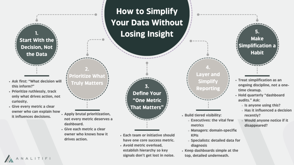
Start with the decision, not the data. The most effective analytics frameworks work backwards from a specific question or choice that needs to be made. Before building any dashboard or tracking any metric, ask: “What decision will this inform?” If the answer is vague or nonexistent, don’t build it. Amazon’s famous “working backwards” approach applies perfectly here, write the insight or recommendation first, then determine what data you actually need to support it. This forces brutal prioritization. A product team doesn’t need to track every feature interaction; they need to know which features drive retention and which create friction.
A sales team doesn’t need twenty pipeline reports; they need to understand conversion bottlenecks and deal velocity. By anchoring analytics to decisions, you naturally eliminate metrics that exist only to justify someone’s existence or satisfy curiosity. Every metric should have a clear owner who can articulate exactly how it influences their actions.
Implement the “one metric that matters” philosophy, layered intelligently. While your organization likely can’t operate on a single number, each team or initiative should have one prima`ry metric that defines success, supported by a handful of secondary indicators that provide context. For a SaaS company, revenue might be the north star, with activation rate, expansion revenue, and churn as the critical supporting cast, not 47 engagement metrics that create noise. This doesn’t mean ignoring other data; it means establishing hierarchy.
When Airbnb focuses on “nights booked,” everything else becomes either a leading indicator of that metric or a diagnostic tool to understand it better. Create tiered reporting: executives see the vital few metrics that matter most, managers get one level deeper for their domains, and specialists can drill into granular data when needed. This layered approach preserves depth while maintaining surface simplicity.
Finally, make simplification a continuous practice, not a one-time project. Schedule quarterly “dashboard audits” where teams ruthlessly evaluate every metric: Is anyone actually looking at this? Has it influenced a decision in the last three months? If we removed it tomorrow, would anyone notice? Kill reports that fail these tests.
Consolidate tools where possible, if three platforms track similar things, choose one and commit to it. Establish governance rules: new metrics require retiring old ones, new dashboards need executive sponsorship, and anyone proposing a KPI must explain the decision it informs. Train teams to communicate insights, not just data, replace dense spreadsheets with clear narratives that highlight what changed.
Conclusion
Complex analytics don’t create clarity, simplicity does. The most advanced models and dashboards are worthless if no one understands them, trusts them, or acts on them. True power lies in making insights impossible to ignore. Simplicity transforms data from an overwhelming burden into a catalyst for faster, smarter decisions.
Clarity isn’t about having less information but about having the right information. Focus on the metrics that matter. Retire vanity dashboards, challenge every KPI to justify its existence, and align every report with a real business question. When every data point has purpose, analytics stops being noisy and starts driving momentum.
At Analitifi, we help organizations cut through complexity. Our team audits analytic environments, removes redundancy, and builds lean, decision-focused frameworks that actually get used. We turn cluttered data ecosystems into clear, actionable systems that accelerate growth and confidence.
The best insights don’t come from having more data, they come from knowing what to ignore. Start simplifying with Analitifi, and watch clarity become your competitive advantage.
Schedule a FREE consultation with us and build a data foundation that actually moves your business forward.