

Despite the explosion of data tools and dashboards, many organizations still struggle to make confident, timely decisions. Executives log in to dazzling visualizations and endless KPIs, yet walk away unsure of what actions to take next. Most dashboards are designed to present information, not to influence action. They effectively show what has happened, but rarely provide clarity on what should happen next.
This gap between analytics outputs and actionable insights is where decision-making stalls. When metrics aren’t tied to business context or strategic objectives, even the most sophisticated dashboard becomes little more than a digital report. Decision-makers don’t need more data, they need guidance, relevance, and clarity.
Actionable analytics addresses this challenge by reimagining how data is designed, structured, and delivered. With the right approach, analytics can evolve from passive reporting to an active decision-support system, one that empowers leaders to act with confidence and precision.
The Gap Between Analytics and Action
Every morning, executives log into their dashboards and face a familiar paradox: more data than ever, yet decisions feel no easier to make. The problem isn’t lack of analytics, it’s navigating the overwhelming flood of them.
Metrics overload has become the silent productivity killer. When marketing tracks fifty KPIs, sales monitors a dozen pipeline dimensions, and operations juggles countless efficiency scores, the sheer volume becomes paralyzing. The human brain wasn’t designed to synthesize dozens of metrics simultaneously. When everything is measured, nothing stands out.
Even when leaders identify the right metrics, they hit another barrier: lack of context. A dashboard shows customer acquisition cost increased 23%, but is that alarming or expected? Without understanding seasonal patterns, competitive shifts, or marketing mix changes, numbers float in isolation, demanding interpretation but providing none.
Perhaps most insidious is poor alignment with business goals. Analytics teams build dashboards around data models and system architectures, while executives are trying to answer strategic questions: Should we enter this market? Is our pricing working? Which investments will drive growth? The mismatch forces leaders into a frustrating translation exercise.
This is why executives struggle with dashboards, it’s a mismatch of design and workflow. Most analytics tools are built by data specialists for data specialists. They speak the language of correlation and variance. Executives need answers framed in the language of strategy, risk, and opportunity.
Decision Intelligence offers a fundamentally different approach. Instead of starting with data and building up to insights, it starts with decisions and works backward. Rather than asking “what can we measure?” it asks “what do we need to decide?”, then orchestrates data, models, and context specifically around those decision points. It transforms analytics from a reporting exercise into a true decision support system, finally closing the gap between data and action.

What Makes Analytics Actionable
The difference between analytics that sit unused and analytics that drive decisions comes down to four essential elements.
Strategic alignment means every metric connects directly to a business objective that matters. If you’re focused on market expansion, your analytics should surface customer acquisition trends in target segments, competitive positioning data, and resource allocation effectiveness, not vanity metrics about website traffic or social media followers. The question isn’t “what data do we have?” but “what decisions are we trying to make?”
Visual storytelling with context transforms raw numbers into narratives that executives can absorb in seconds. A line chart showing revenue decline tells you something happened. That same chart annotated with a product launch date, competitive entry, and seasonal benchmark suddenly tells you why it happened and hints at what to do next. The best analytics don’t just show trends, they explain them in plain language, highlight anomalies, and surface the context needed for sound judgment.
Prioritization is perhaps the most underrated element. Actionable analytics ruthlessly curate what gets attention. Instead of fifty metrics sprawling across multiple tabs, focus on the vital few that actually influence decisions. Use visual hierarchy to distinguish between what requires immediate action, what needs monitoring, and what’s simply informational. When executives can grasp the key insight in under 30 seconds, analytics become a decision accelerator rather than a cognitive burden.
Finally, truly actionable analytics incorporate predictive and prescriptive insights. Descriptive analytics tell you what happened. Predictive analytics tell you what’s likely to happen next, while prescriptive analytics go further, they recommend specific actions and estimate their impact. “Churn is projected to reach 20% next quarter based on current trends” is predictive. “Implementing a targeted retention campaign for high-risk customers could reduce churn to 12% and generate $2M in retained revenue” is prescriptive, and that’s what transforms data into decisions.
When analytics embody these four principles, they stop being reports to review and become tools that guide action.
Designing Dashboards That Influence Decisions
Great dashboards don’t showcase data, they facilitate decisions. The difference lies in how deliberately they’re designed around the people who use them and the choices they need to make.
Principles of Effective Analytics Design
Clarity and context trump complexity every time. Resist the temptation to cram every available metric onto the screen. A dashboard that requires ten minutes of study isn’t a dashboard, it’s a report disguised as one. Each element should answer a specific question or highlight a decision point. If a metric doesn’t directly inform an action, it doesn’t belong on an executive dashboard.
Map KPIs directly to business outcomes, not system outputs. “Database queries per second” is a technical metric. “Average customer wait time” is a business metric. “Customer satisfaction score and its correlation to retention rate” is an outcome-focused KPI. The best dashboards bridge this gap explicitly, showing not just performance indicators but their downstream impact on revenue, profitability, market share, or whatever strategic goals matter most.
Embed narratives and calls-to-action directly in the interface. Don’t make executives translate data into meaning, do it for them. Add brief annotations explaining what changed and why. Include threshold indicators that signal when metrics cross into action territory. Provide next-step recommendations: “Customer acquisition cost exceeded target by 18%, review marketing channel mix” or “Inventory turnover slowing in Northeast region, consider promotional campaign.” The dashboard should guide decision-making, not just enable it.
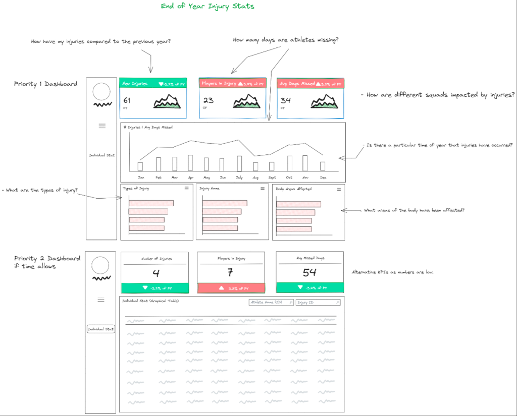
Image Source: The Data School
Visual Best Practices
Effective dashboard design follows predictable patterns that align with how executives actually process information.
Color hierarchy directs attention where it matters. Use color sparingly and purposefully. Red signals problems requiring immediate attention. Yellow indicates caution or areas to monitor. Green confirms things are on track. Neutral grays fade less critical information into the background. When everything is brightly colored, nothing stands out, reserve visual emphasis for what truly deserves focus.
Layout flow matches decision priority. Position the most critical metrics in the top-left quadrant where eyes naturally land first. Arrange supporting details in a logical reading pattern, typically left to right, top to bottom. Group related metrics together spatially. Create clear visual sections that separate strategic overview from operational details. Executives should be able to scan the top third of the dashboard and grasp the overall situation instantly.
Simplicity scales better than sophistication. A clean bar chart often communicates more effectively than an intricate heat map. White space isn’t wasted space, it gives the eye room to rest and the brain time to process. Limit fonts, chart types, and visual styles. Consistency reduces cognitive load. The goal is instant comprehension, not impressive complexity.
Before and After: A Strategic Redesign
Consider a typical sales dashboard cluttered with twenty metrics across four tabs: pipeline value, conversion rates by stage, rep performance rankings, deal velocity, forecast accuracy, activity logs, and more. Leadership rarely used it because extracting insights required too much effort.
The redesign started with one question: What decisions does the sales executive actually need to make? The answer: prioritize resources across regions, identify at-risk deals early, and adjust forecasts for board updates.
The new dashboard opened with three key insights at the top: quarterly revenue trajectory vs. target (with confidence intervals), top three regions requiring intervention (with specific recommended actions), and deals over $100K at risk of slipping (with owner and next steps). Secondary tabs provided supporting details only when needed.
Metrics dropped from twenty to seven on the main view. Color highlighted only exceptions, deals at risk appeared in amber, regions ahead of target in muted green. A single narrative box updated daily with AI-generated insights: “Northeast pipeline weakened 12% this week due to three enterprise deals pushing to Q2. Recommend shifting two reps from the Central region where we’re 23% ahead of target.”
Usage quintupled within a month. More importantly, decision speed improved. The executive could assess the situation in under a minute and knew exactly where to focus. That’s the difference between a dashboard that reports and one that influences.
Conclusion
The analytics revolution promised to make organizations smarter, faster, and more competitive. Yet somewhere between collecting data and making decisions, many companies got stuck. They built impressive data infrastructures and sophisticated dashboards but struggled to translate insights into action. The bottleneck was never technology, it was the fundamental approach.
Decision Intelligence offers a way forward by flipping the paradigm. Instead of building analytics and hoping they inform decisions, start with the decisions that matter and architect everything around them. This means ruthlessly prioritizing metrics that connect to strategic objectives, designing dashboards that tell clear stories rather than display comprehensive data, and embedding predictive and prescriptive insights that guide action rather than just document history.
The shift requires more than new tools or redesigned dashboards, it demands a cultural change. Analytics teams must evolve from data reporters to decision partners. Executives need to articulate not just what information they want, but what choices they’re trying to make. Organizations should measure analytics success not by how much data is visualized, but by how quickly and confidently decisions improve.
Transform Your Analytics with Analitifi
Making this transition isn’t easy. It requires rethinking your entire analytics approach, from how you define metrics to how you design dashboards to how you embed insights into decision workflows. That’s where expertise makes all the difference.
At Analitifi, we specialize in closing the gap between analytics and action. We don’t just build dashboards, we design decision engines tailored to your strategic objectives. Our approach starts with understanding the critical choices your leadership team makes, then architecting analytics solutions that make those decisions faster, smarter, and more confident.
Whether you’re drowning in metrics that don’t drive action, struggling with dashboards executives ignore, or simply ready to evolve from descriptive reporting to prescriptive intelligence, we can help. Let’s transform your data from a reporting burden into your most powerful strategic asset.
Ready to build analytics that actually influence decisions?
Contact Analitifi today to schedule a free consultation and discover how decision intelligence can transform your organization.